
Overview
Problem
The process of requesting a Riot Sign On (RSO) Client was inaccessible to third-party developers and time consuming for producers on the team.

Our Approach
Our goal was to reduce the long communication process faced by external developers and Riot Producers, as well as increase the integration of RSO. We wanted to provide external developers the opportunity to request an RSO Client, which will reduce the amount of back-and-forth communication with the team and the time it takes to get a Client integrated.
FOR EXTERNAL DEVELOPERS
Create a streamlined, self-service experience that allows external developers to independently request and manage RSO Clients in an external portal.
FOR RIOT PRODUCERS
Reduce operational overhead and increase efficiency by automating the RSO Client request process so Producers only need to review and approve applications.
ROLE
UX Designer
(Sole Designer)
SCOPE
UX Design, Design Strategy, Visual Design, UX Writing
DURATION
9 months
IMPACT
The team was able to reduce wait times and errors for external developers, process over 9000 apps in the first year, and save Riot producers 45 hours in the first 3 months.
PROCESS
Understanding Users' Needs
Our users consisted of two groups of people: External developers and Riot Producers - each with different goals.

PROCESS
User Journey Mapping
I crafted three different user journeys detailing the current user experience, future-state (before automation), and future-state (after automation). These outlined the user actions, as well as pain points in the journey and where improvements could be made.

SOLUTIONING
A New Platform for Requesting an RSO Client
The journey maps highlighted areas of improvements in the different phases of the user journey and recommendations for the new experience.
.png)
PROCESS
User Flow Mapping
I created flow maps to detail out the steps and flows we would need to account for as we started design work. These were separated out into short, mid, and long-term to account for the scope of work the team had aligned on. Afterwards, I held collaboration sessions with my cross-functional team to review the flows in order to foster alignment and make sure that we accounted for every aspect of the user journey. These user flows were also instrumental in feature prioritization.

APPROACH
Design Goals
Faster Approval
Reduce the total time to API access request approval for external developers by automating parts of the external dev RSO client request process.
Designing for Support
Minimize common points of confusion for external developers with supportive content and interaction design.
Increased Efficiency
Increase efficiency of the Dev Relations team so that they can spend more of the time on emergent issues and troubleshooting.
DESIGN
Early Explorations
I started off with exploring different form displays and navigation for the client form, such as breaking down the form so it is more digestible, and utilizing a progress indicator to navigate through the form.
Because the form didn’t have too many fields, we decided to keep it simple with a scroll navigation.
DESIGN
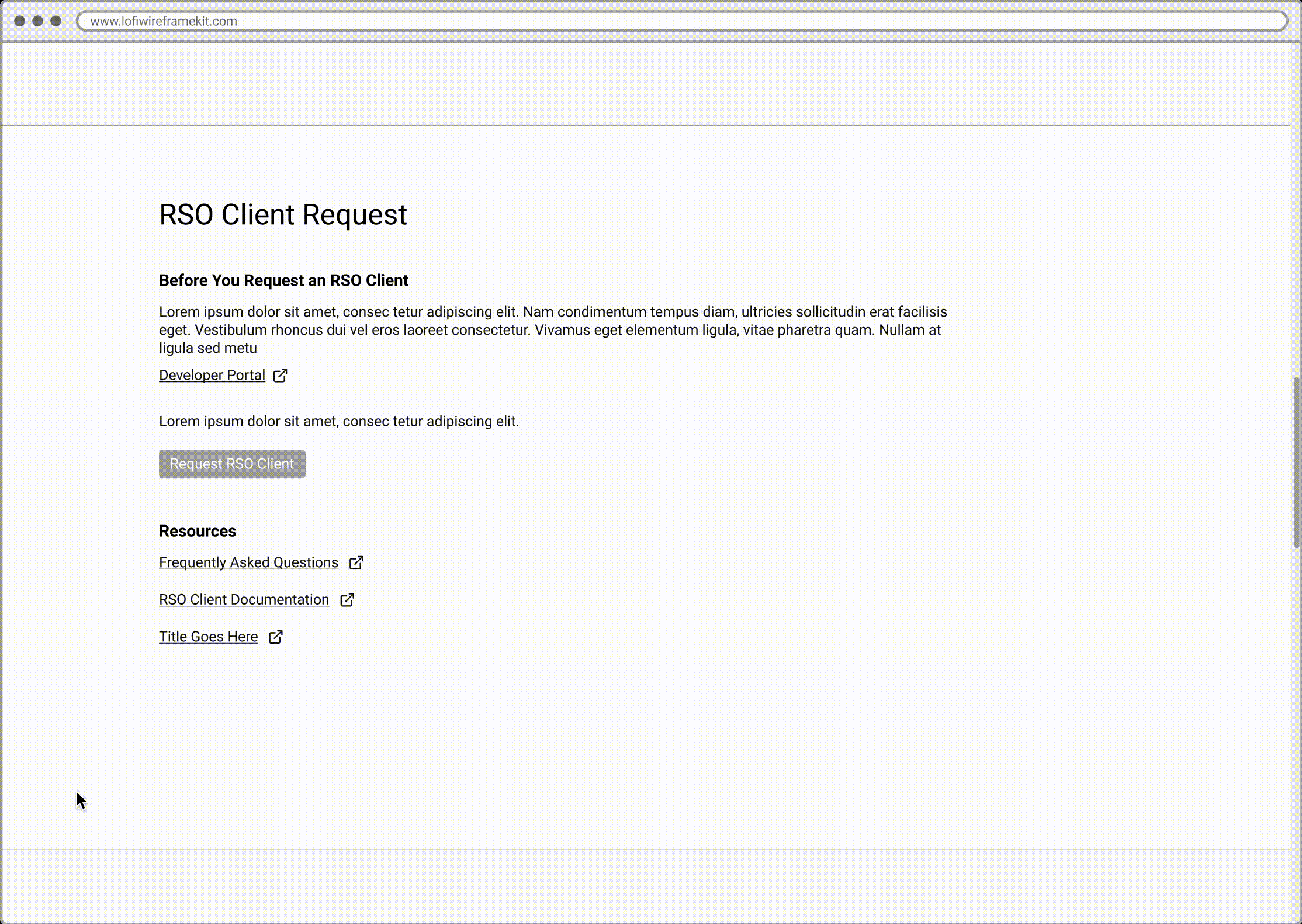
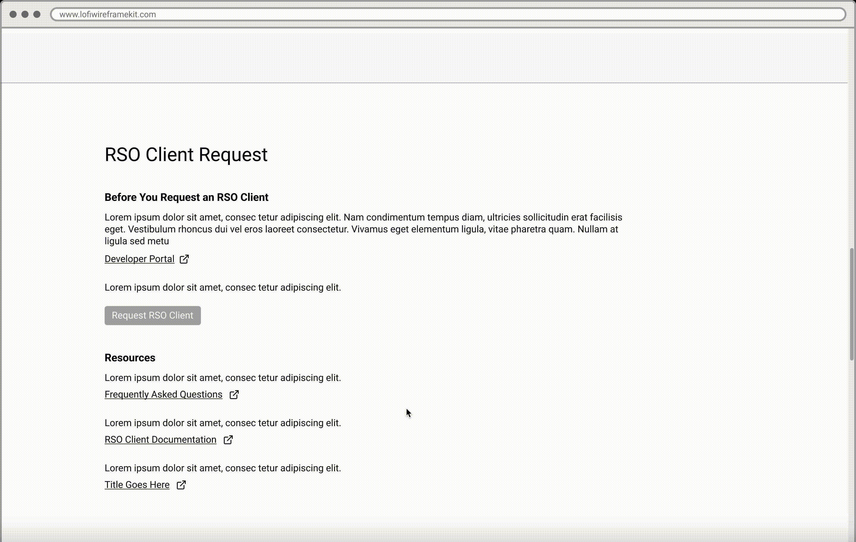
Low-Fidelity Wireframes
During a design feedback session, we decided to align with the design system of our already existing internal tools to reduce the visual scope, so we did not want too much customization for the MVP. I redesigned the wireframes to reflect this decision.
Please note: because the design of this flow utilized the design system for our internal tools, it has been blurred for confidentiality purposes).
.png)
.png)
.png)
DESIGN
Prototypes
Because this was a new process we were introducing to users' workflow, I fleshed out the prototypes to include a documentation hub for user instructions, as well as copy recommendations for different error states.
Please note: because the design of these flows utilized the design system for our internal tools, it has been blurred for confidentiality purposes).
RSO REQUEST FLOW
.png)
.png)
.png)
DOCUMENTATION HUB


.png)
ERROR STATES

DESIGN
Expanding the Visual Scope
Though the team initially decided to deprioritize the visual scope for the MVP, I expressed to the team that it would be beneficial to invest additional time into the visual design work to align with Riot's branding and visual language, especially for a public-facing platform. Due to this, we were able to prioritize the visual work and refined the prototypes to reflect Riot's visual language.
I collaborated with a visual designer on the larger platform team to ensure that the website visual design was consistent with Riot's public-facing websites. The biggest challenge while working on the visual design was balancing aesthetics and consistency with communication, as we didn't want scenarios where non external developers thought the website was game-related. We wanted to differentiate this website as developer-facing.

DESIGN
The Producer Experience
The goal for Riot producers with this project was to reduce the back and forth involved in the application request process and streamline the approval process. This would make for a quicker process due to the reduction of manual work and increase the adoption of RSO, which was one of the team's goals.
We created a new portal that lived within our internal tools hub to allow producers on the team to view all requests and their statuses, as well as review and approve (or reject) requests.
Due to the nature of this work (internal tooling), the designs are blurred for confidentiality.
%201.png)
%201.png)


%201.png)
%20(1).png)

%201.png)
DESIGN
Additional Iterations and Releases
Throughout the next year, we made numerous updates to the website to address users' needs and streamline the client request and management process.
App Management
We decided to utilize 'apps' instead of clients to better align with the management process, as users will be able to view and manage their apps, which will include their RSO Client.

Modifying App Details
Users can make changes to most information under their approved apps, and request changes to others. This is so as to reduce the likelihood of inappropriate content being shown to players.

Navigation Redesign
We wanted to expand the features offered on the website and support the long-term goal of migrating the workflows on the current developer portal to this new website. I suggested implementing a top navigation system to better align with the larger Riot ecosystem.

Documentation Experience
We expanded the documentation system by moving it to its own page and implemented a side navigation.

LAUNCH AND IMPACT
9,000 apps processed, 45+ hours saved.
After 9 months of work, we launched the External Developer Portal (Beta) in April 2023.
This was a fun, challenging project that enabled me to grow quickly through leading the design work and strategy, as well as being the sole designer on a team. We were able to reduce wait times and errors for external developers, process over 9000 apps in the first year, and save Riot producers 45 hours in the first 3 months.